The goal of the project was to provide a flyer design with a new visual identity aligned with the client’s image and tone of voice, creating a printable overview of his services, supporting him with digital templates and social media presence. This project was done in the early 2025.
Client: Osteopath Practitioner in Italy, Marco Morleo
Service: Visuals & Content
Industry: Health & Wellness
Focus: Visual Communication, Layout Optimization, Print & Digital Design, Brand Identity
The Visual Identity Starting Point
Marco is an osteopath running a private practice in diverse offices (appointment booking). His clientele is very solid in the aerea and his primary goal is not to have more clients, he was not looking for quantity. He was looking for a first step into brand building: something that reflected who he was, what he offered, and most importantly, how he made people feel.
The goals are:
- Establish a recognizable visual presence in local clinics and community spaces through printed flyers.
- Lay the foundation for a future digital presence on social media and website.
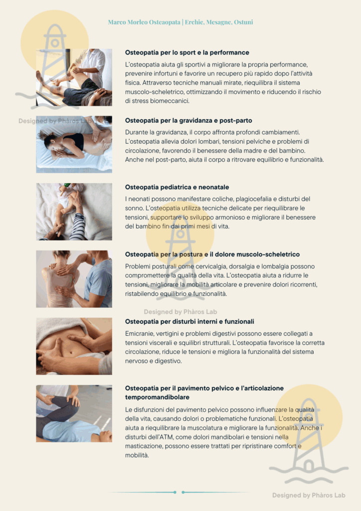
The majority of the flyer include simply the name, the address and a list of bullet points for the various services within the Osteapath practice. Surely we wanted to give information about the location and booking details, but we wanted to give a meaning behind every word, intention behind every color. This was about tone of voice, energy, and emotion.
The ultimate goal was enriched by the following tasks:
- Highlight key info at a glance with a calm image and detailed overview of the benefits
- Reflect the brand’s personality and values through the tone of voice and the colors
- Deliver files ready for print and digital use
The Approach for The Visual Identity
The Visuals and Content service at Phàros Lab, we believe design is a form of storytelling, also in print. For this project, I translated the client’s emotional direction into a tangible, elegant communication tool: a double-sided flyer.
Visual Direction: Freshness & Calm
Starting from the choice of the colors and the idea that his work evoked in me, I decided to go with the following emotions and sensations: freshness, safety, and calm. I developed a custom color palette based on the blue of his logo, adding soft, neutrals, and light textures.
Every visual element was chosen to inspire ease and clarity, echoing the experience of his treatments.
Design & Content Structure
- Created a double-sided flyer with space to explain not just what services were offered, but why they mattered.
- Structured content to allow narrative and intention, rather than a bullet point list..
- Balanced white space, typography, and subtle visuals to ensure legibility and trust.
Print & Digital Assets
- Delivered a print-ready PDF with professional bleed and margin setup
- Adapted the same visual style into a social media graphic template, offering visual consistency across platforms
- Conducted a live review session with the client to ensure every word and color felt right
Final Assets & Bonus Material
Hosted a live revision call for quick feedback and fast implementation
Delivered two versions: print-ready (CMYK, bleed) and digital (PDF, RGB)
Included a free matching social media graphic template.
The Outcome
A printed flyer that doesn’t just inform but it communicates purpose, care, and calm
A visual identity built from scratch and ready to grow across platforms
A highly satisfied client who finally felt his practice “looked like it felt”
Why It Matters
At Phàros Lab, design is never just decoration but it’s communication. When you’re in a profession built on trust and connection, your brand should reflect that. This wasn’t just about design, but it was about creating emotional alignment between the practitioner and the people he wants to help.